Sunday, June 29, 2014

Durham Press Artists At The Print Center

This week I checked out The Print Center's exhibit featuring renowned artists who have recently created works at Durham Press. The exhibition description reads:
...they have built a reputation for producing complex and often large-scale screenprints, woodcuts and mixed media projects.

Indeed, that is exactly what I found. In this post I feature works by three of the artists, each of whom incorporated the element of woodcut into these large, complex images, and in a similar way. Specifically, they each used printed wood grain to add texture. 


The first image here is by Chitra Ganesh. You can view this and more works by her at Durham Press here, and her professional website here. The title is Architects of the Future - City Inside Her. To me, this image and others in the series definitely had a futuristic feel. The woman's floating head and strange sort of goggles with cords that wind back to both an upsidedown city in the sky and ancient structure cause me to imagine that she is plugged into some kind of virtual reality. The use of the wood block is, of course, to create the texture in the sky, red and swirling, reminiscent of either sunset or sunrise, either of which allude to changes, endings and beginnings. Seeing such an obvious example of the low-tech wood block juxtaposed with an image of unfamiliar technology, I cannot help but think, too, of the German Expressionist Blue Riders, whose intent was to make works firmly connected to both the past and the future. 


Next up is a work by Mickalene Thomas. You can view this and other works she made at Durham Press here, and her professional website here. The title is Deux Femmes Noires. As it says, two black women are the subject, naked, sleeping, and comfortably entwined. I imagine that the collaged environment where they have been placed describes more of a psychological state than any literal surroundings. The bits and pieces illustrate grass, trees, and other plants, sky, perhaps also some water. Again, wood block printing is used to add the texture of the grain to an entire symphony of patterns, textures, and layers. Bits of cloth from the original photo remain, though here it suggests that the couple lies on a blanket which has been spread out in an open and natural setting. The pieces are mismatched, cut apart, separated by peach-colored lines, suggesting rapid movement, the passage of time, flicks of faulty memory. Despite the surrounding chaos and limited perception, this clearing seems a peaceful oasis. 


This third and final image I wanted to feature is by Beatriz Milhazes. You can view this and other works she made at Durham Press here. I found no professional website, but here is the Wikipedia entry on this artist. This print is called Snake Dreaming. I feel the variety of textures in the fields of wood grain run parallel to the asymmetry of the colorful form in the center. Where I saw flower pedals, I now see slithering ribbons, and hear the vibrations of strings. The whole image is so deceptively balanced and prettily designed, it would be easy to miss the mystery. The longer I look, the more I feel I am being drawn into a portal to the unknown. 

Friday, June 27, 2014

Owl and Cat in Love, Cover

"Owl and Cat in Love"
Woodcut (reduction)
11.75" x 11.25" (image)16" x 15" (paper)
Oil based inks on Sulphite Block Printing Paper 
Limited edition of 3

After over a year and a half, all the art for my visual re-telling of Edward Lear's The Owl and the Pussycat is complete! Now it's time to put together a proposal package and begin seeking a publisher. 

Words can't express how much I've benefited from the encouragement of my friends, family (especially you, mom), colleagues, and this blog's readers. Even if you never comment here or on facebook, seeing the number of pageviews increase over time, and increase the most when I've been posting the newest images from this project, have kept my confidence high when I've felt overwhelmed  by other responsibilities and when I was slowed down by illness. Thank you all so much. 

I'll be taking about a 3 week break from studio work, and then I plan to maybe do some highfalutin serious art before diving into the next book. Not sure where the muse aims to take me, but no doubt it'll involve wood blocks and chisels. 

Thursday, June 26, 2014

Owl and Cat in Love, "Dancing Under the Moon" (final image, page 29)

"Dancing Under the Moon"
Woodcut (reduction)
11.25" x 11.75" (image)15" x 16" (paper)
Oil based inks on Sulphite Block Printing Paper 
Limited edition of 3

After their wedding, Owl and Cat dance on the beach under the moon. I have to wonder just what kind of mincemeat is in that bowl. 

Now that the story is all told (although I do have the cover, which I'll post tomorrow) I'm thinking about the role that color has played throughout this whole journey. It seems the whole story is really about this couple holding on to the primal glue that binds them together as everything else, including their own bodies, constantly shifts in tone, distorts, or dissolves. While the colors and types of setting (field, interior, seas, forest) might drastically change from page to page, the protagonists are always woven into their environment. Here, too, they almost melt into the chaotic sky. They fit in wherever they go and make it seem easy and natural. They succeed in changing together, and that is the key to their Love.

Although I've used the emphasized wood grain in most of the images for this book, this is the only image where I use a knot as part of the composition. Given that they just got married, I know there's a bad pun in there somewhere. 

Monday, June 23, 2014

"The Campers" by Ben Hoffman Abramowitz

I found this woodcut in the Met's collection. The prolific Ben Hoffman Abramowitz passed away in 2011 but still has an active website.

A woman leans her elbows on the balcony rail and gazes out at the landscape, road, and a twisty-twirly tree with three figures seated on a bench beneath. It's not clear what the trio are waiting for, although two out of the three seem to be gossiping to pass the time away. The bald man beside the woman on the balcony turns his head as if he's heard a curious sound or juicy bit of information. Another man, bear-chested, wearing a yellow hat and perched on the farther rail gawks outward in the same direction as the woman. It's a fine view, green, and teeming with life under a cloudless sky.

Vacations are a time to get away from the hum-drum of regular life, relax, yes, but on such hot days, people also need distractions.


Saturday, June 21, 2014

Owl and Cat in Love, "Wedding" (double page spread pages 27-28)

"Wedding"
Woodcut (reduction)
9.5" x 20" (image)
15" x 24" (paper)
Oil based inks on Sulphite Block Printing Paper 
Limited edition of 3

It isn't so much that the Land Where the Bong Tree Grows is the Galapagos Islands. The Galapagos Islands are more symbolic than that for this retelling of Lear's poem. All of the animals indigenous to the islands and pictured in this wedding's congregation are famous for having undergone an evolutionary transformation that makes them unique from their ancestral cousins on the mainland. So, too, have Owl and Cat undergone a transformation through their union (just imagine the kids!) Also, there aren't any turkeys or piggy wigs found on the Galapagos.  

Wednesday, June 18, 2014

"Klänge" by Vasily Kandinsky

I've been starring at this print by the incomparable expressionist Kandinsky, who spent a career translating sounds into images. I go to write a response, but too many half-baked metaphors cloud my brain and do no justice to all that is there before my eyes. I do what I always do when I feel overwhelmed by the possibilities of words; I write a haiku:

A bucket of nails
Poured over a steal table
Symphony of sounds

Sunday, June 15, 2014

Owl and Cat in Love, "Welcome" (double page spread pages 25-26)

"Welcome" (parts 1 and 2)
Woodcuts (reduction)
Each is 11.25" x 11.75" (image), 15" x 16" (paper)
Oil based inks on Sulphite Block Printing Paper 
Limited editions of 3 each

The pair who have been spying on Owl and Cat for the past three double-page spreads are finally noticed. They reveal themselves as ambassadors of the island bearing gifts of beaded necklaces which match ones they themselves wear. The message is this: We, the natives of this island, accept and welcome you to our tribe.

Up until this point, Owl and Cat have been a nation of two. Now, they have found a whole new community in which they can redefine themselves as a couple. 

Wednesday, June 11, 2014

Woodcuts in ICPNY's New Prints 2014/Summer Exhibition (Part 3 of 3)

...continued from yesterday:

Transmission #3 by Howard Paine 

The great blackness, simultaneously bulging and voice, reaches out toward the left, activating buds which grow red with stimulation. The neglected counterparts on the right remain still and gray, but their time will come soon enough.

This print resonated personally for me as I've just endured a five day hospital stay for pancreatic followed by two procedures to remove a pancreatic stone which was causing the trouble. Afterward the doc gave me photographs taken inside my gut. It felt amazing to see photographs taken by a tiny camera which had traveled down my throat all the way down to my digestive organs. The technological possibilities today are so impressive, yet creepy. The creepy often comes out in how medical staff speak to worried patients; at some point the doctor told me that if this procedure didn't work they'd have to "filet" a valve. Um, can we not talk about my organs using a butcher's vocabulary? But the fact is, the technology fixed a problem. No more pain, and they didn't even have to open me up. 

Ah, what mysterious worlds exist within the wholes of bodies and on the level of viruses and cells. How alien it appears when we look close enough. Even more-so when we dare to touch. 


Howard Paine's organic work (check it out on his website) is a sort of visual quest into the strange and small, if not microscopic environments where naturalists and scientists dare to tread. He begins with having direct contact with his subjects, but the images develop through an elaborate process that often combines traditional printmaking with digital assemblage and machine printing.

In his statement he says he wants to "start a conversation." Certainly so many mysterious, often ominous, yet oddly familiar images hold that potential. I particularly love that he makes images of butterflies which are not pretty. 


Runoff by Bill Pangburn 

Is this the mess we mean to clean up after the fact? Or is it what we were seeking the whole time, and just didn't know? I thought I wanted to go home and sit in a freshly-vacuumed living room. Maybe read a book. Some New York Times best seller featured twice on NPR. But now I'm not sure. Something is nagging at me. I feel I need to stay here and witness this. Not speak or otherwise interact. Just witness. 


Bill Pangburn creates purely abstract works. In all the many examples of installations and works on paper from his website, lines of varying thickness and color slither, drip, are draped, or otherwise work their way down a vertical composition. Each is titled specifically, and after looking at the whole collection, the title "Runoff" does seem most appropriate for this particular image. Pangburn is one of those artists who has found a keyhole through which to discover the whole world; a body of work such as his shows the limitlessness of variation. 

Ruckenfigur by Barry O'Keefe 

I think I know that guy... no, nevermind. 


Barry O'Keefe has a large number of other wonderful woodcuts featured on his website, including a couple more ruckenfigurs, sleeping subjects, and portraits in profile in the portraits section - I totally feel like a creeper who stares at people at coffee houses or on the bus after checking those works out. But in a good way. 

O'Keefe is an up-and-coming, socially-conscious artist. Still in his 20's and working on his MFA at Ohio University, he's already had a significant impact in his hometown of Richmond, Virginia; the East End Cemetery where many African American residents were buried had become overgrown from neglect. O'Keefe created limited edition woodcut portraits of three of the most prominent people who were buried there and then sold them to raise money toward the restoration efforts. Learn about those portraits here, and an article in Style Weekly from earlier this year here

I look forward to following O'Keefe's career and seeing what he creates in the years to come.


Tuesday, June 10, 2014

Woodcuts in ICPNY's New Prints 2014/Summer Exhibition (Part 2 of 3)


...continued from yesterday

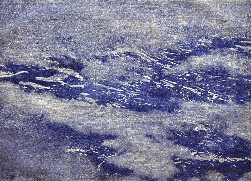
Clouds and Reflections III
 by Jelena Sredanovic 

Dreamed I was a bird
Flying above the clouds, where

Boundaries mean nothing. 

Sredanovic has a whole series of woodcuts of clouds, as well as woodcuts of reflections, shadows, and ripples in water. What a remarkable challenge: to capture in a still image that which is so fluid and translucent using wood, which is so solid and opaque, not to mention difficult to carve.    

As I learned from her website, Sredanovic earned her MFA from the Academy of Fine Arts in Novi Sad in 2005 and is now working on her PhD at the University of Arts in Belgrade. She shows regularly in Serbia and Spain, as well as other parts of the world. 


Waterway by Gesine Janzen 

At first I think I notice only the creek. It is an odd, meandering shape, like a wrench that's being melted down for scrap. I see that across the way there are trees, and much closer to where I stand there are low-lying plants, reeds and such. Nothing is in focus, and the colors are so muted and grey. Not muddy grey, but cold. The longer I look, the more it seems that everything around here is disintegrating. As the pieces fall away, I notice more water. Water seeped into cracks and other unassuming spaces. Water from the sky. Water underground.  Water that makes a squishing noise when it mingles with the earth under my feet. I see how the water belongs to everything. 
Gesine Janzen is a prolific printmaker; her portfolios (which you can check out on her website) feature mostly color woodcuts. Her work reflects a deep connection to the American Midwestern landscape. Waterway is from a whole series depicting the Missouri River. Being from the Midwest myself, I recognize the vastness and peaceful solitude. 


Architectural Possibilities (Articulation no. 20) by John-Marc SchlinkI find myself pondering the play between what is (merely? breathtakingly?) possible and what is (disappointingly? astoundingly?) real. The seductive power of Platonic forms verses the flawed reality that feeds us. A hastily-written notation on a preliminary blueprint verses a solid, metal pipe. 

Schlink teaches at Hamline University and is better known for his intaglio prints. Indeed, this print is a woodcut over an intaglio print. It is part of a whole series of Architectural Possibilities. I love how the rough textures of the woodcut portions of the image interact with the much more precise and shadowy etched portions. 

Continue on to the third and final installment of this exhibition review. 


Monday, June 9, 2014

Woodcuts in ICPNY's New Prints 2014/Summer Exhibition (Part 1 of 3)

This is the start of a rundown of thoughts about the woodcuts featured in New Prints 2014/Summer at the International Print Center New York. I'll post three more artists tomorrow and a final three on Wednesday. For any printmakers out there, IPCNY takes submissions for its New Prints shows three times a year. Best of all, no submission fees. Learn how to submit and join the email list here. 


Earth, by Brenda Malkinson.

From a far enough distance, the storm is lovely and calm. Two atmospheric swirls over a topsy turvy sky form the eyes of a giant bird who overlooks the celestial dawn. This ocean that is our everything is poured out like grains of sand through an hourglass. The end of the world will not bleed. It will burn, slowly, but for now, let's go for a quick dip. 


Malkinson makes glass artworks and woodcuts. (Check out her website here.) Wood and glass are such different materials, but what they have in common is an emphasis on an arrangement of shapes and on the natural textures of the materials themselves. Both are used in the rigid and geometric construction of buildings (supportive beams, windows), and yet both lend themselves well to the creation of organic forms. Both inevitably contain an array of subtle imperfections (cracks in the wood, bubbles in the glass), particularly when worked by a single artist's hand. 


Irish Standing Stone II by Jim Lee 

Everything moves at its own pace. It's odd to encounter a rock that stands upright, such as myself, as if we are two souls who have met in the street and have paused to size each other up. The clouds above move rapidly in the wind. That same wind tickles the grass to quiver. There is a long, stone wall and white house in the distance. This fellow has been here much longer than they have. 

Jim Lee enjoys a successful career, having exhibited internationally and founded Blue Moon Press over 30 years ago. He also teaches at the Hartford Art School. While I obviously love this print, I like his color prints and the more whimsical imagery featuring animals even better. So I'll keep that in mind for future posts. You can find some of his works online here and here


 A Travers (Through) by Luca Cruzat 

You can never be sure just what will happen when you walk through a door. 

Luca Cruzat has a pretty fantastic artist's website and blog. She works with several art-making materials, including collograph and screenprintmaking, thread and paper, and 3D works using thread, fabric, paint, and more.

On her website, her woodcuts are the most purely abstract works. It's far more satisfying to see them all together as a series than to just see this one, since together a more thorough exploration becomes apparent of what can be expressed with the grain of the block and just a few traditional cutting techniques.

I also really like what Cruzat has done combining woodcuts with other printmaking techniques in her Recent Works, particularly using uniquely woodcut-derived textures to enhance the expressive quality of the images. 


To be continued... 

Friday, June 6, 2014

Nursery Rhyme Illustrations by Francis Donkin Bedford

Here are a few selections from Francis Donkin Bedford's A Book of Nursery Rhymes, first published in 1897. Bedford is one of the great illustrators from the so-called Golden Age of Children's Literature in the Western world. We're talking late 1800's, early 1900's, the era of Winnie the Pooh, Alice in Wonderland, the nonsense poetry of my beloved Edward Lear, and many other classics. Bedford's prints now reside in many prominent museums in the United States and Europe. This first image of Little Boy Blue can be found in the Met's collection.

What I love best about all of these images is the gentle, yet expressive use of color. 
There is a continuous play of contrast between warm reds and cool greens, yet the colors are muted enough to create a comfortable atmosphere. Each scene seems to be taking place on a sunny day in springtime. The most dramatic use of color is in Jack and Jill's scene, where Jill's bright red frock (along with her wild hair) conveys a sense of distress. But again, it is playful and mild. There is no need to spill blood when creating literary drama for a child. Children are more sensitive than adults, since so much of the world is still new to them. 


What I love second best about Bedford's nursery rhyme illustrations is how much the characters, both major and minor, are integral to a complete environment. The color of any one child's complexion or hair is repeated elsewhere in flowers, trees, and the roofs of houses. It is almost impossible to 
zero in exclusively on anyone for long. Instead, the viewer is forced to see the people in a larger context. We see the mother's reaction to Jack and Jill's fall down the hill. We see the children in the background who are running, carefree, oblivious to the child in the foreground who weeps over the drowned pussycat. This pulls away from the typically Western sense of the individual, and connects the actors to each other and the place in which they reside. 


Sunday, June 1, 2014

Owl and Cat in Love, "Nesting" (double page spread pages 23-24)

"Nesting"
Woodcut (reduction)
9.5" x 20" (image)
15" x 24" (paper)
Oil based inks on Sulphite Block Printing Paper 
Limited edition of 3

Every once in a while I find a picture book that features a vertical double page spread that requires the reader to turn the book sideways. I just love that; the illustrator throwing out something a little unexpected, forcing me to move my hands, shift weight around, and really pay a little closer attention to what's in front of my eyes. I simply had to do it with this book.

Here Cat and Owl are going back to their arboreal roots, having built their own literal love nest on their new island home.

And still they are being spied on by natives who they have yet to meet. That's coming in the next double page spread.